Sarah Jossel reveals the elegant design and palate cleansing colours in her Chichester family kitchen.
When beauty editor, broadcaster and author Sarah Jossel and her husband Edward moved into their large Victorian terrace in North West London, they knew they wanted to make it a home for their young family to grow up in. And while the property had been sympathetically extended by the previous owners, they also knew that the very contemporary, grey slate kitchen that sat at the back of the house, leading onto the garden, was not the look or feel they wanted to achieve. ‘While everything looked very smart, it felt cold and rather sterile, like a showroom,’ recalls Sarah.
Instead, with a three-year-old and a one-year-old, the couple wanted to create a space that was sophisticated but also warm, comforting and liveable for their family. A place that worked just as well for family breakfasts, afternoon playtime for their daughters and entertaining friends in the evenings.
Sarah describes their vision for the house décor as heritage-inspired and quintessentially British. ‘We wanted it to feel rich in character and textured, and for the kitchen to feel like a slice of the Cotswolds in the centre of London - but it should also feel like our family home.’ They discovered the answer to this look when they walked into Neptune Fulham. ‘Everything felt smart and had a country vibe but not in a cottage-core way,’ she adds.


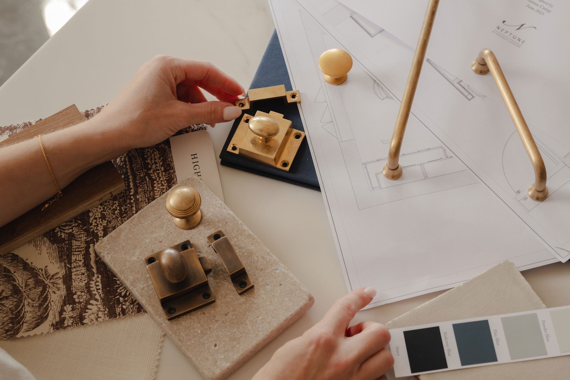
The couple worked with kitchen designer Claire, based at Neptune Swindon, to realise their vision. ‘The process was quite simple,’ recalls Sarah. ‘Once we’d chosen the Chichester cabinetry, we worked with Claire on the details. She asked us to consider things such as where the sun fell in the kitchen through the day and, for a busy, family kitchen, steered us away from using marble worktops. She sent us samples of both marble and quartz, and we couldn’t even tell the difference. We now love our quartz worktops.’


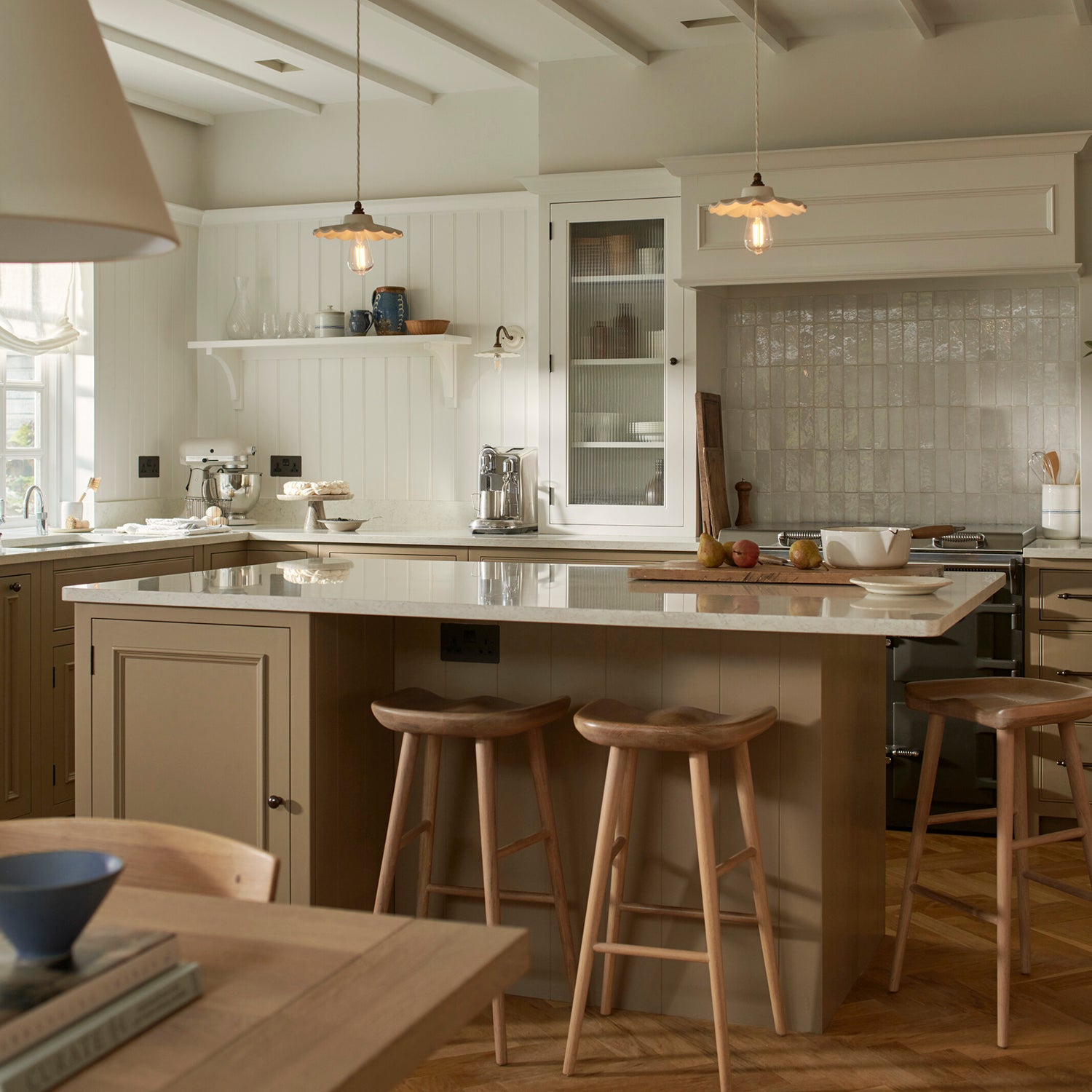
Colour was always going to be an important element in the decoration. The couple had used strong colours in other rooms – green for the formal dining room, blue for the children’s playroom – but when it came to the kitchen, they wanted a ‘palate cleanser’. ‘One of the kitchens in the Fulham store was painted in Polenta and we fell madly in love with it,’ says Sarah, using it on the cabinetry and walls, combined with the pinky tones of Orkney White along the fourth wall. ‘Polenta is a statement colour but also a neutral and has proved to be a real conversation starter – everyone who comes in asks what the colour is.’


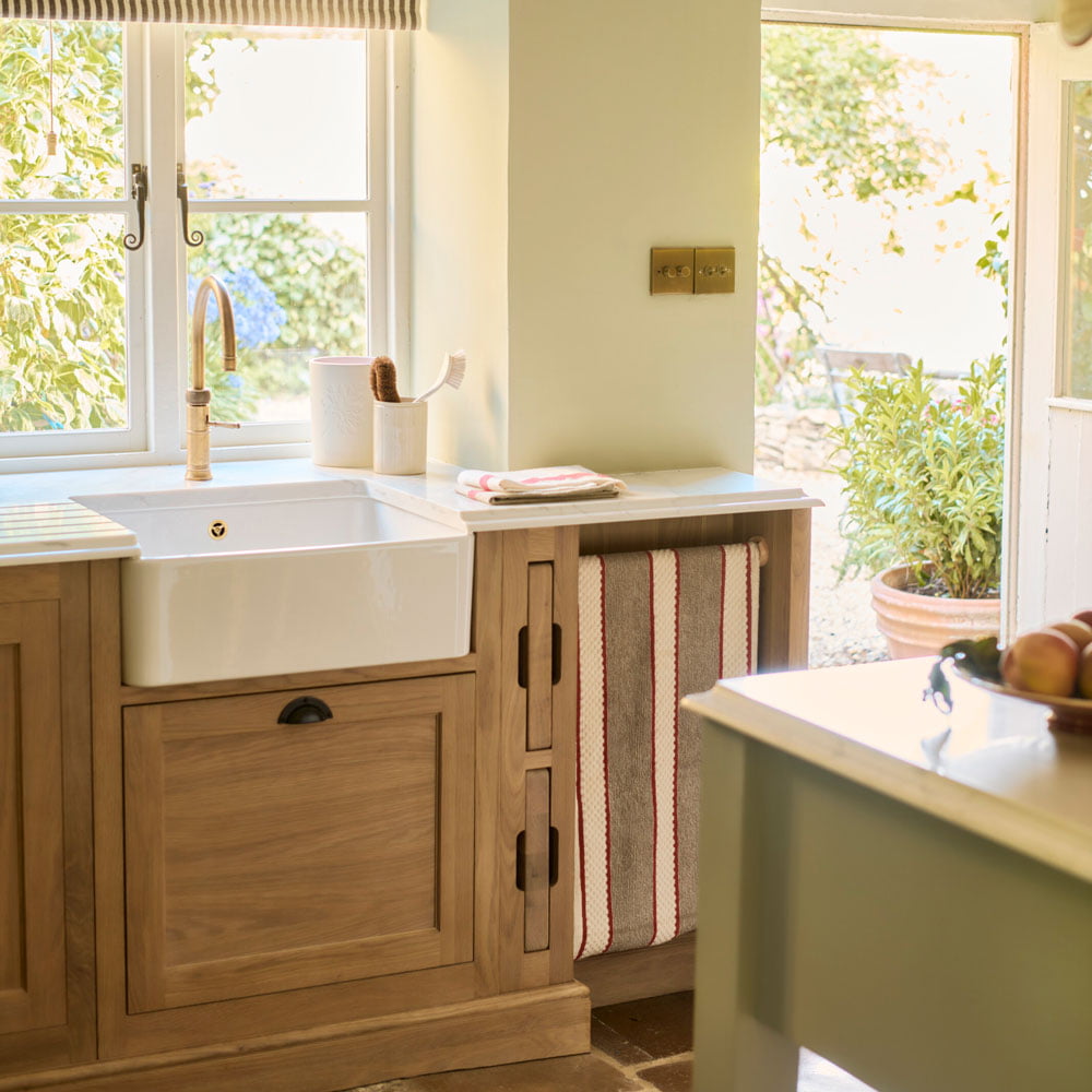
Originally, Sarah had envisaged a sink in the central island but again, Claire advised against this. ‘On social media you see these sinks in the middle of kitchens and imagine yourself standing chopping vegetables but in reality, in a busy kitchen, the sink area is more likely to be piled with plates. A feature sink is a terrible idea if you are at all messy,’ laughs Sarah. Instead, they positioned the sink in one corner and incorporated a double larder that ‘everything gets thrown into when visitors come!’
Keen to ensure the kitchen was a living and dining space, they built an upholstered banquette around a large circular Balmoral table and paired it with Wardley chairs to echo the Wardley bar stools at the island. The floor was laid with limestone tiles to extend that Cotswold farmhouse feel – ‘I didn’t realise that the bigger the slabs, the bigger the space feels,’ notes Sarah, and the couple added a fluted glass wall cabinet to display their glass and crockery in.


The result is a warm, welcoming kitchen that balances a welcoming country feel with the sophistication of city living. ‘This is a place where we will create memories,’ observes Sarah, ‘our children can be unapologetically themselves in here and we can entertain and fill the kitchen with all our favourite people.’