

North, south, east or west facing, the presence – or lack – of natural light has a big influence on the way our spaces look and feel. And the ways we decorate them. Whatever direction your rooms face, we’ve got you (and your walls) covered. Here’s our guide to picking paint shades accordingly.
North facing rooms
Rooms that face north typically get a lot less light overall. The light that does filter through also tends to be on the cooler side. Because of this, it’s best to pass up paint colours with grey or green undertones in favour of those with warmer ones. If you’re looking to keep things neutral, yellow-based shades (like Old Chalk and the rest of the Fossil palette, or Cotswold and Calico from our archived Earth palette) will help to bounce the little light you do have around the room.
Alternatively, you may want to embrace the darker aspect, and opt for a much deeper shade. Saturated colours will come across even darker in north facing rooms, so here’s your chance to create a truly cosy, cocooning space. Clove, Walnut, Peat, Juniper, and Fine Mahogany are all great contenders for the job.


South facing rooms
In contrast to north facing rooms, those that face south enjoy strong natural light throughout the day. Most colours, whether cool or warm toned, will work well (although they can appear yellower because of the warmth of the light), so it all depends on the look and feel you’re going for. If you’re hoping to balance the strength of the sunlight, cooler shades, and those with blue or green undertones like Alpine or Aqua Blue, are best. Red-based neutrals, meanwhile, are particularly effective at enhancing the warm and cheerful outlook of south facing rooms. Our Salt, Silver Birch, and Driftwood paints all share this reddy base.


East facing rooms
If your room is east facing, you’ll enjoy a bright start to the day, with the light lessening (and cooling) throughout the afternoon and evening. This cool evening light can work to your advantage if you’re looking to create a calming sitting room or bedroom for unwinding in later in the day. Keep to soft blue and green paints without too much grey, such as French Grey, Sage, Flax Blue, or Powder Blue, and it shouldn’t feel too cold. Alternatively, red and orange tones are a natural choice if you’re looking to counter the coolness in a dining room or sitting room. Paprika, Burnham Red, and Burnt Sienna all fall into this camp and will create a warm and welcoming feel.


West facing rooms
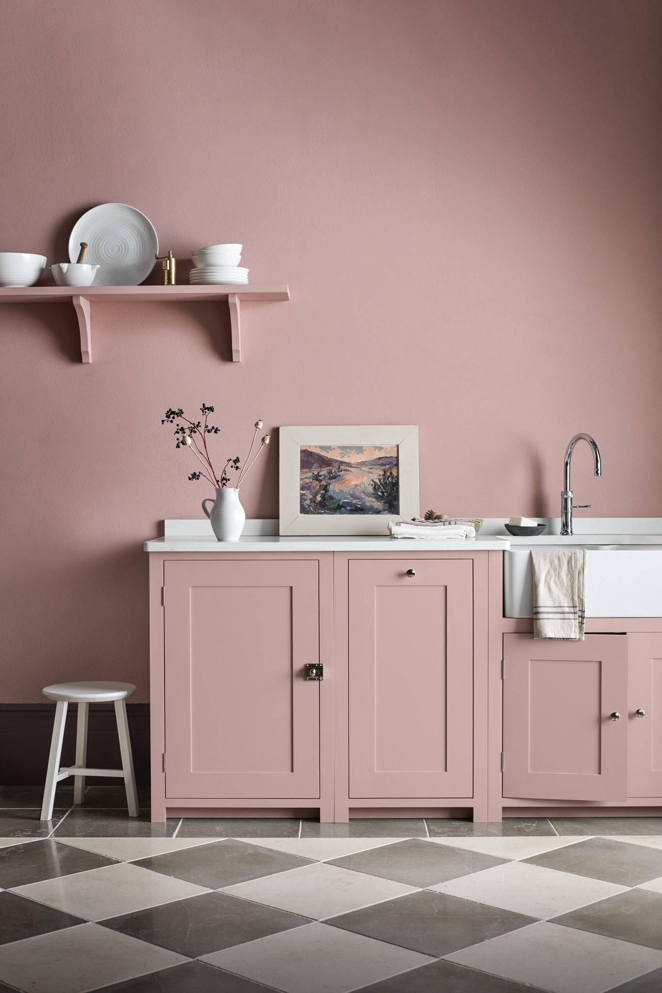
With cool, subdued light in the morning, west facing rooms experience plenty of warm light by early evening. If you have a west facing room that’s used from the early hours of the morning and on into the evening (such as a study or kitchen), red and pink toned paint colours like Paprika, Old Rose, and Silver Birch will help to cast a subtle warm glow in the absence of sunlight and then enhance it later on. If it’s a room that’s used most later in the day, and you’re a lover of a neutral palette, try cooler tones like Shell or Snow. They’ll feel fresh early on but then neutralise in the evening by the warmth of the natural light.

Discover all the colours in our paint collection online here.


